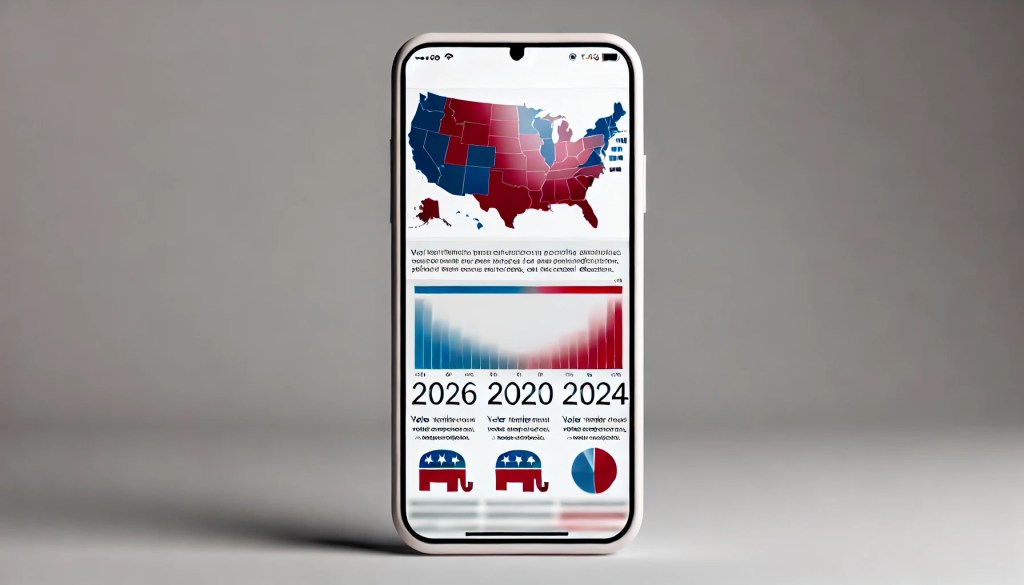
In a world saturated with information, infographics have become an indispensable tool for breaking down complex topics into visually engaging, easily digestible formats. Short for “information graphics,” infographics are everywhere, translating dense data into eye-catching visuals that inform, persuade, or influence public opinion. From explaining scientific discoveries to illustrating social trends, infographics are designed to make information accessible to specific audiences.
In the realm of politics, infographics hold immense power. They can sway voters, simplify policy debates, and provide a clear snapshot of electoral results. Regardless of the goal, these visuals can shape how we perceive political events. Let’s dive deeper into how infographics are used in political communication, focusing specifically on how The New York Times (NYT) employed them on their Instagram to explain critical information about the 2024 election.
Infographics and the 2024 Election: How The New York Times Did It
The New York Times has long been a leader in crafting infographics that educate and engage their audience. During the 2024 election, they used Instagram to share visuals that helped millions of readers understand what happened. Here are three standout examples:
1. Electoral Votes and the Map of 2024
On November 10, NYT posted an infographic breaking down the final electoral vote tally. The visual showed:
- The number of electoral votes each candidate received: Kamala Harris versus Donald Trump.
- The 270 votes needed to win the presidency.
- A map of the United States, with states shaded red or blue based on political affiliations, and striped if one of the candidates flipped the state.
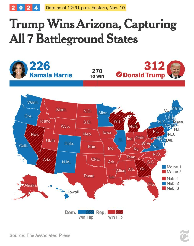
The accompanying message summarized the results: Donald Trump secured 312 electoral votes and claimed every single one of this year’s battleground states. The simplicity of this map made a monumental political outcome digestible for everyday viewers.
2. Swing States: Trends Across Three Elections
Another post from November 8 highlighted swing-state voting patterns from 2016, 2020, and 2024. Through a series of arrows, the infographic revealed how Trump made gains across demographics, even in areas where he ultimately lost.
- Key insight: “While Trump lost to Kamala Harris in many swing-state cities and suburbs, he did so by a smaller margin than he lost to President Biden in 2020.”
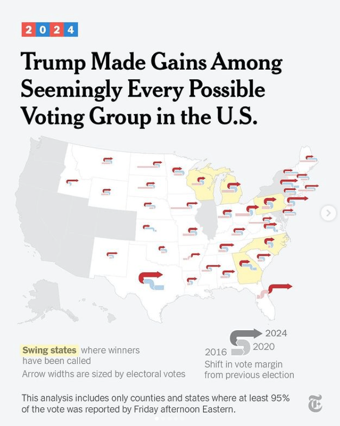
This comparison not only painted a picture of Trump’s evolving voter base but also gave readers a nuanced view of the election beyond the binary win/lose narrative.
3. The Days to Concede: A Historical Perspective
In one of the most poignant visuals, the NYT explored how long past presidential candidates have taken to concede after losing. The infographic:
- Highlighted the traditional process of concession, starting with a private phone call to the president-elect followed by a public speech.
- Compared timelines, showing that Al Gore conceded as soon as the Supreme Court ruling ended a recount, while Donald Trump, 1,460 days later, still has not conceded his 2020 loss.
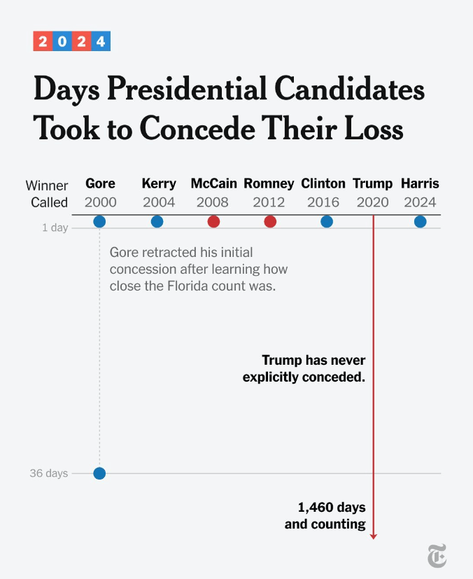
This powerful image indirectly offered context for Harris’s own concession speech, in which she emphasized the importance of honoring election outcomes—a nearly earned media moment for her administration.
Conclusion: Visual Storytelling at Its Best
The New York Times’ use of infographics during the 2024 election wasn’t just educational—it was political storytelling at its finest. By simplifying complex data into clear visuals, they shaped how the public understood the results, voter trends, and the larger historical context. These infographics straddled the line between journalism and political PR, offering a lens into how the election unfolded while also reflecting the narratives each candidate wanted to tell.
In particular, the third example became almost an inadvertent PR win for Kamala Harris, reinforcing her commitment to democratic norms. This is the power of political infographics: they don’t just inform—they influence.
Interested in exploring more about the intersection of political PR and media? I’d love to connect. Reach out to me on LinkedIn to continue the conversation!
*Co-created with AI

Leave a comment